

Role
Product Designer
Services
UX/UI Design
Design System
Formspark (Data Collection)
Search Engine Optimisation (SEO)
Domain Setting Support
Cookie Implementation
Timeline & Status
2 months, Launched in June 2024
Outcome (From July to August)
Problem
The client needed to establish an online presence that effectively showcased her podiatry skills while facilitating easy communication for both general inquiries and home podiatry services.
context


Problem
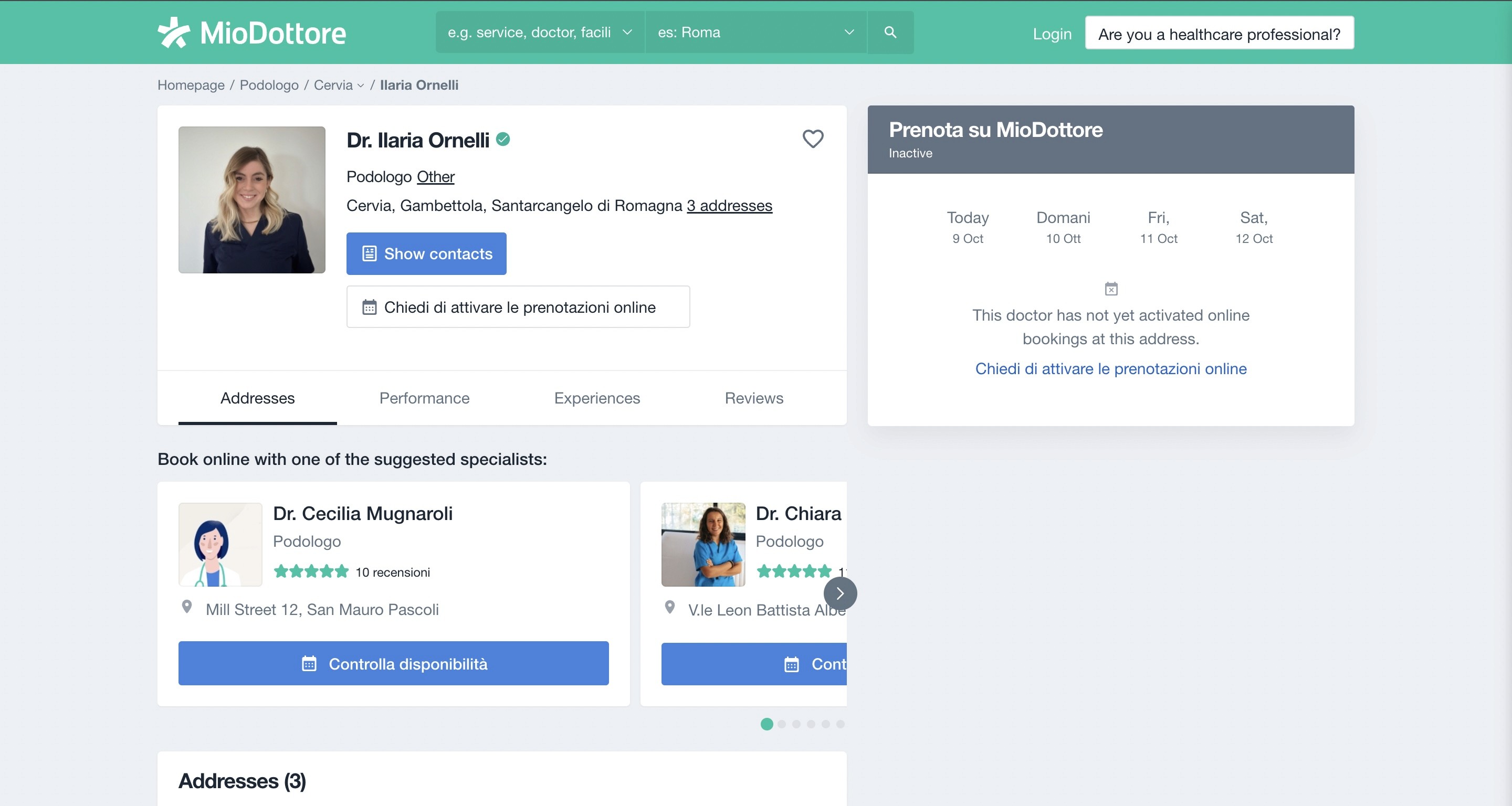

As you can see from the pictures above, Ilaria was already in some platforms,
but she was experiencing the following problems:
Visibility
It was difficult to find her profile among so many professionals on the current platforms.
Effectiveness
The existing platforms didn’t attract any clients to Ilaria.
Usability
The overall user experience wasn’t so intuitive.
Cost
Having tools such as booking systems were quite pricey.
the challenge
research
To start off, I conducted an initial interview with Ilaria to understand her
goals, all the specific requirements for the website and the current tools that she works with.
Transition from a minimal presence on a shared platform to a dedicated website.
Showcase her podiatrist service and background.
Facilitate easy appointment and booking inquiries.
Quickly find all the locations where she works.
Competitive analysis
In order to start designing the whole website, Ilaria and I went through several competitors, exchanging feedbacks and point of views, in this way I could see the area of interests, pros and cons of every website and what we could prioritise.

Key takeaways
WhatsApp is the "TOOL" for communication,
providing users with a quick connection to the professional.
Forms are common too, so the user can easily fill out a form for an urgent visit
Always provide a clear and easy-to-access call-to-action button to contact the podiatrist
Ideation
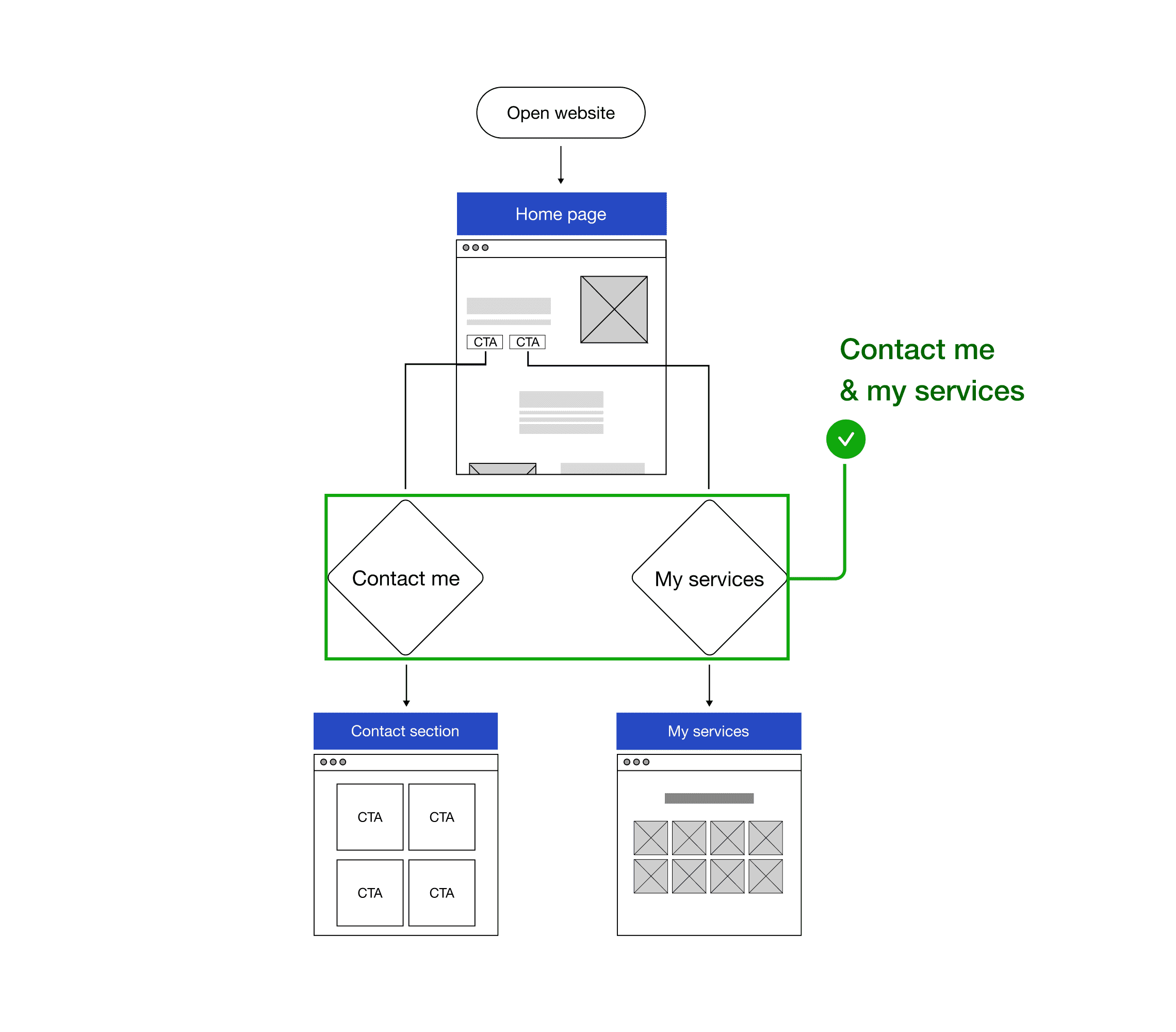
From day one, the goal was to create a clear and concise user flow. We used internal and external feedback to refine and improve the structure, ensuring an intuitive experience throughout the website
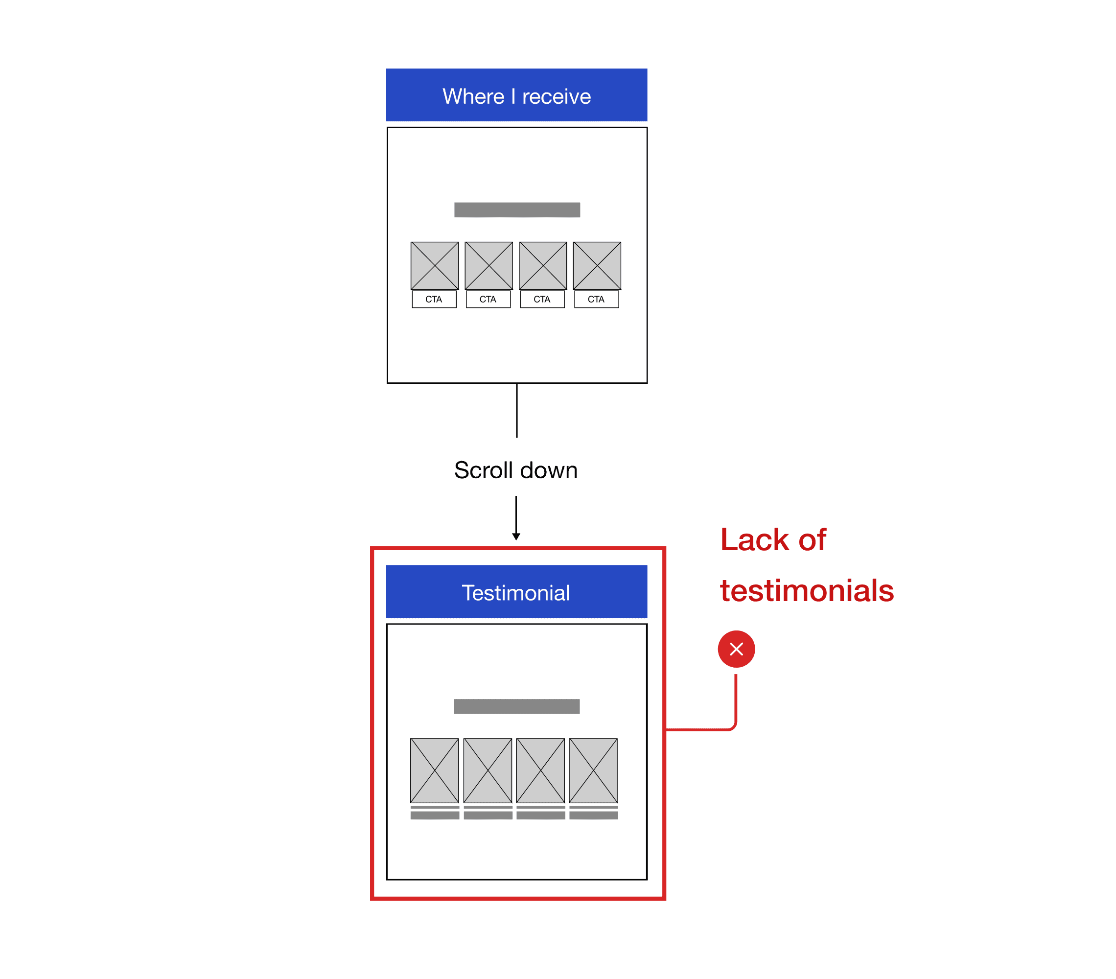
BEFORE
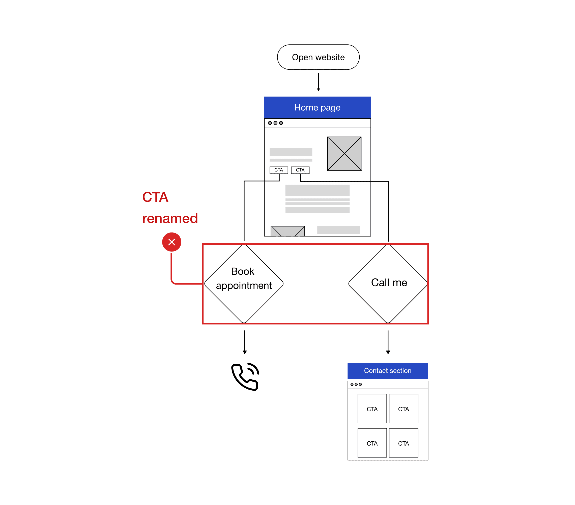
AFTER
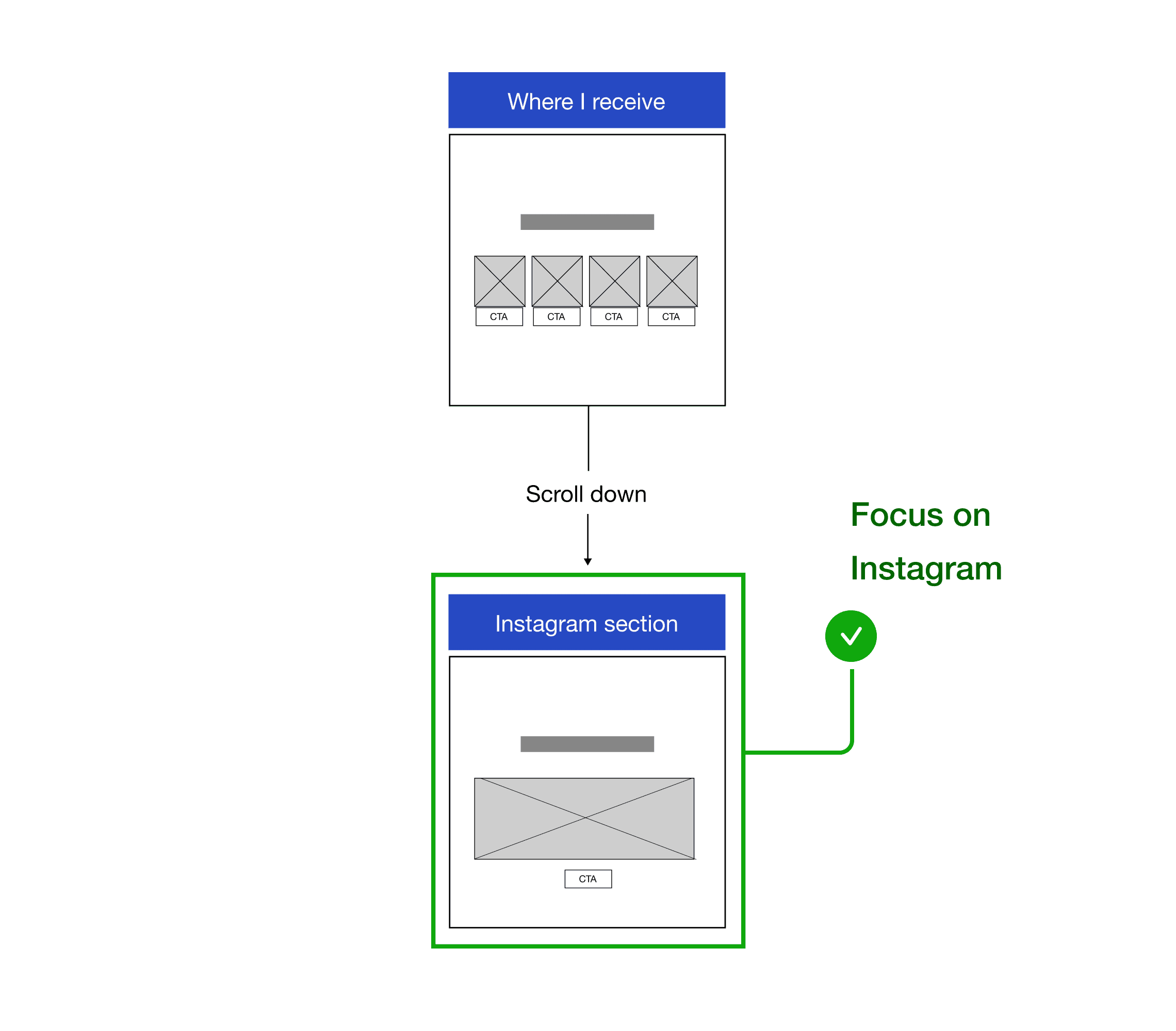
BEFORE
AFTER
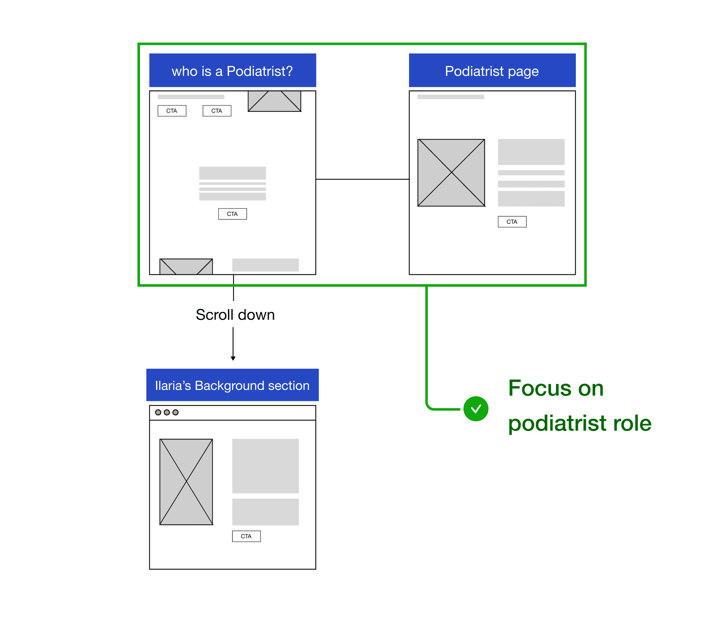
BEFORE
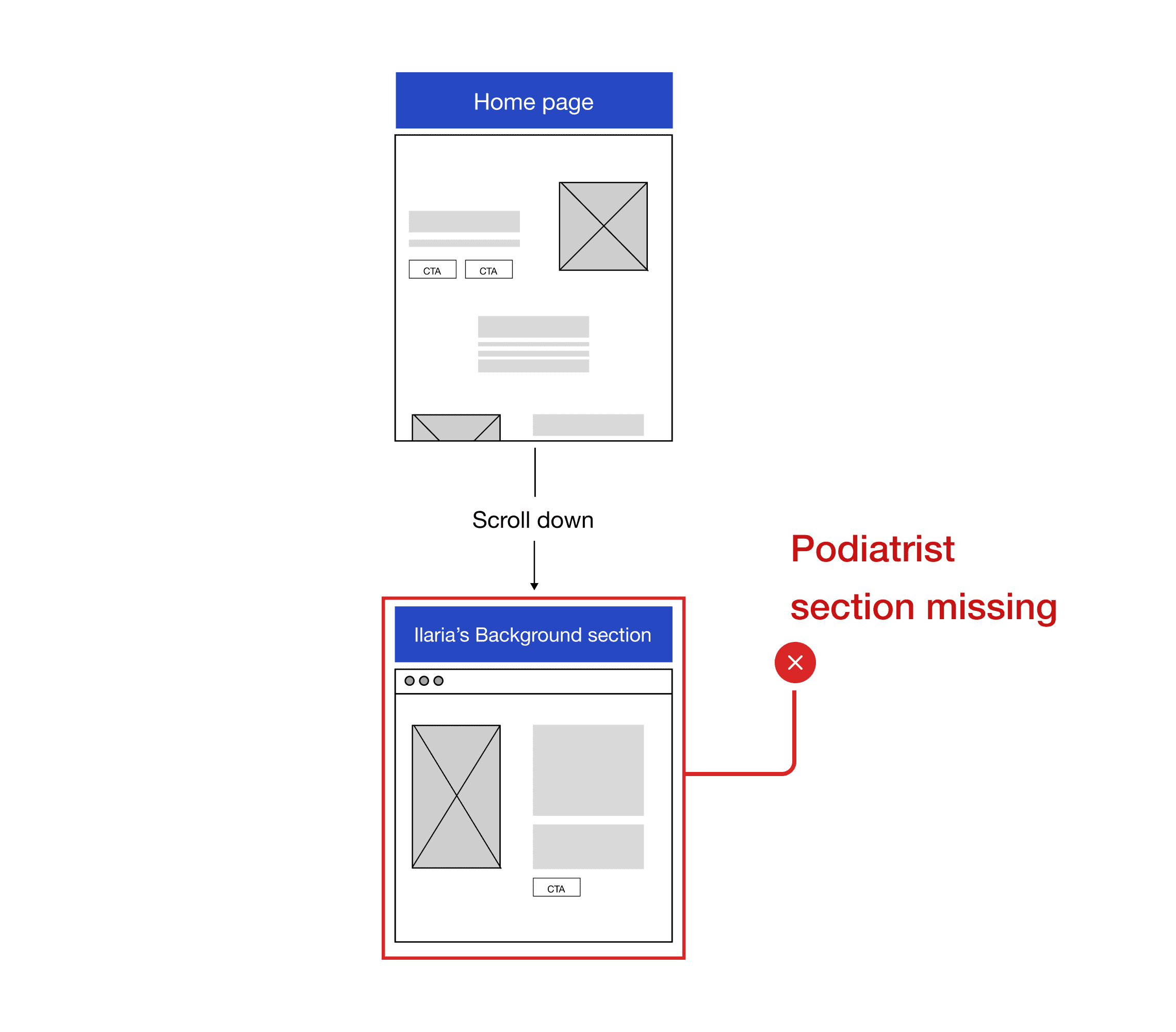
AFTER
During the wireframe I encountered several challenges. Ilaria provided extensive feedback, leading to a lot of back and forth, both of us had limited free time due to our full-time jobs.
Working live on wireframes was very efficient, allowing us to make real-time adjustments and speeding up the process.
Visual direction
The main challenge was balancing the colour scheme in order to highlight the logo that Ilaria proudly designed by herself.
Because the two primary colours look quite dark, I introduced lighter variations to create contrast and ensure the logo stands out.

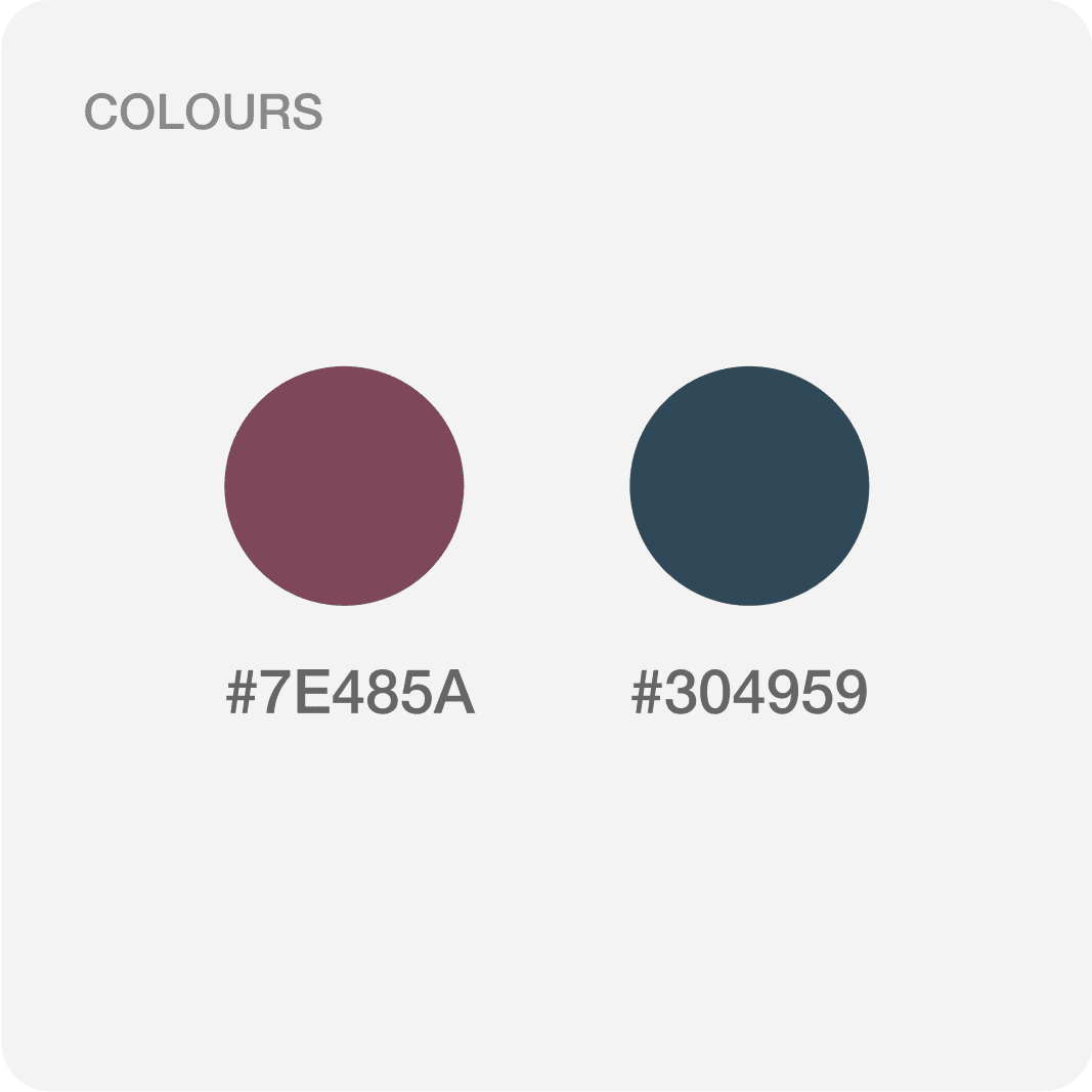

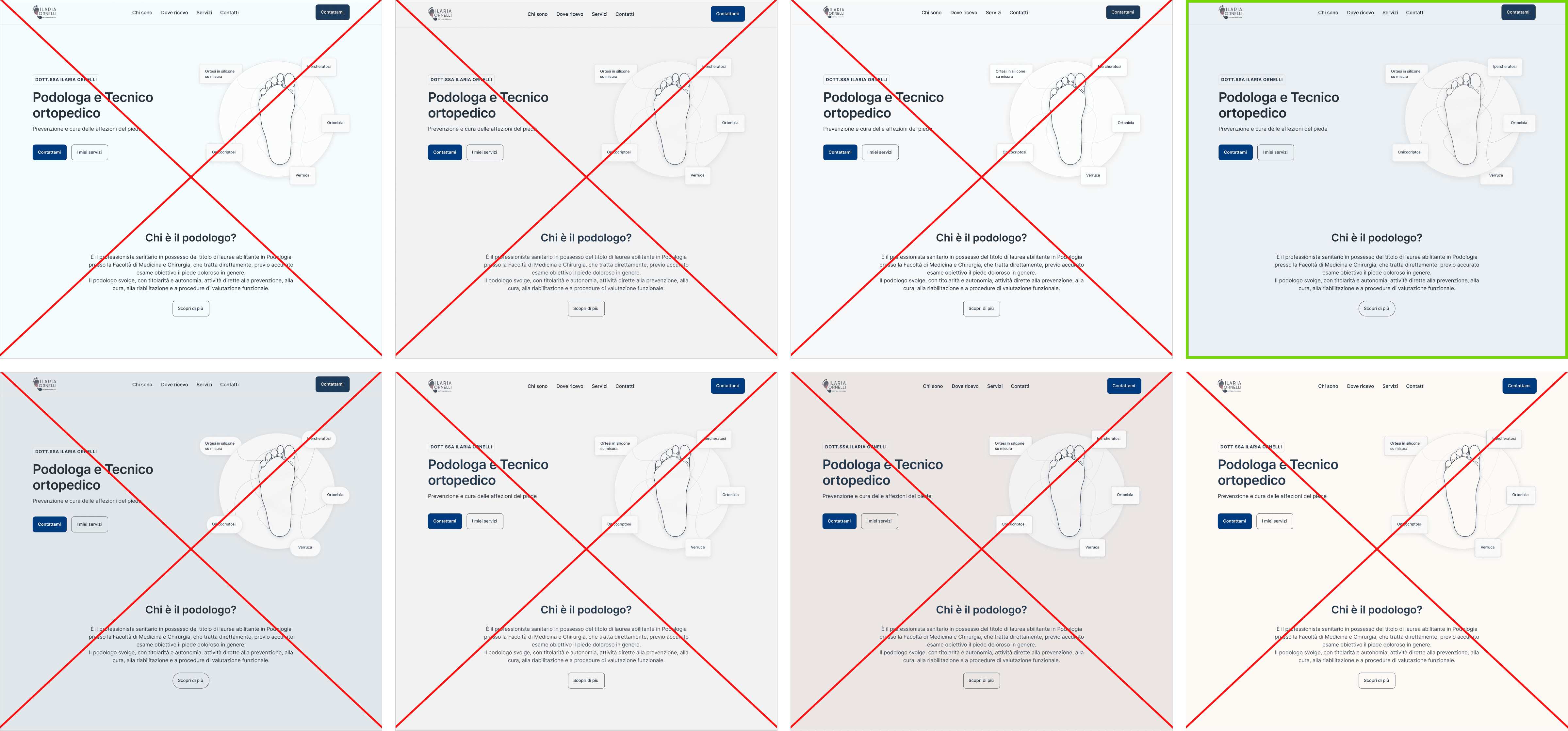

Colour background variations
Usability testing
Yes, everything is cool until you let real users using the platform, this step was crucial to understand if it was genuinely usable, intuitive and engaging as we thought, and helped me to refine different key aspects of the design early on before moving into development.
BEFORE

AFTER

BEFORE

AFTER

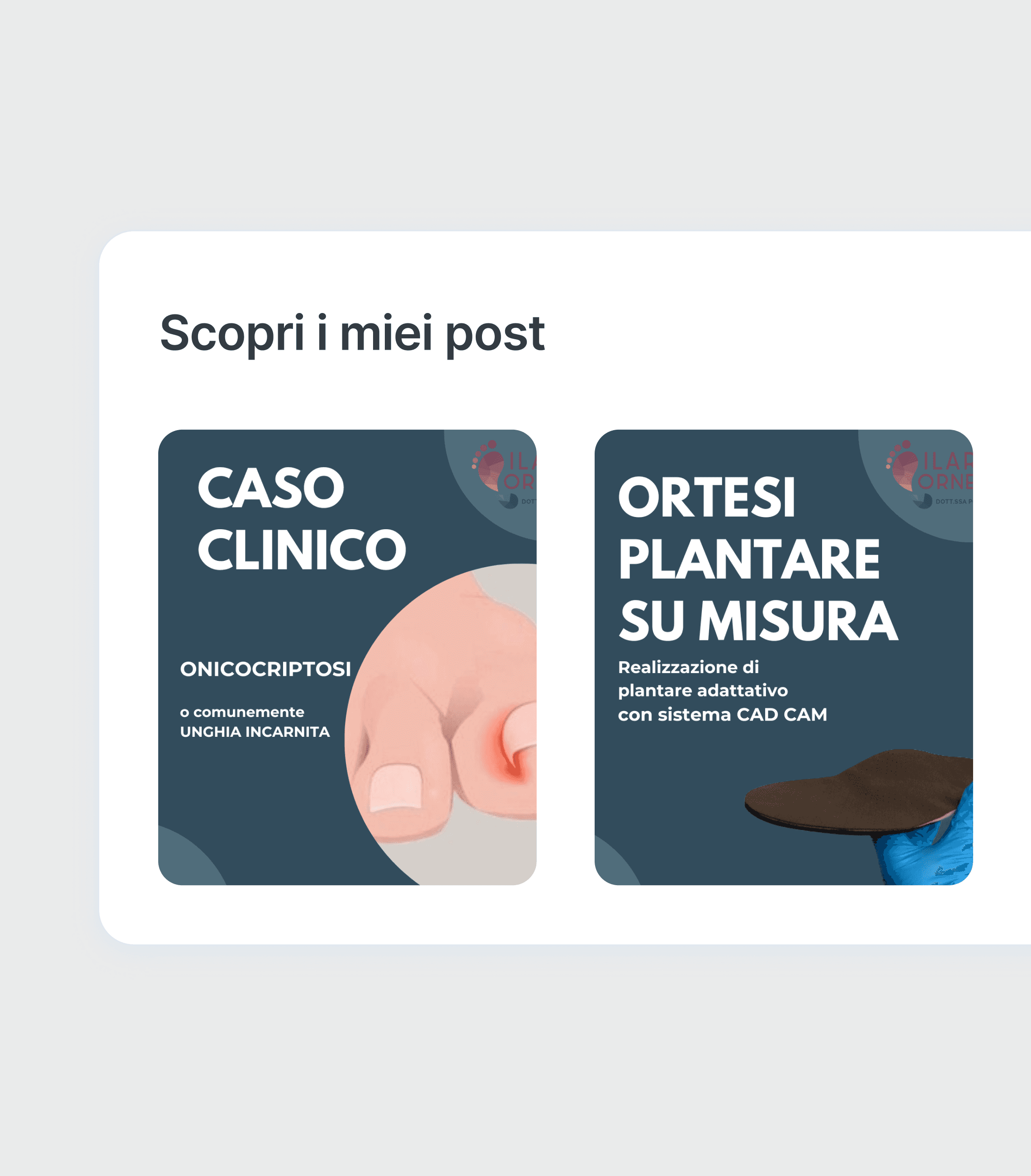
final design
Just click through it and you will find what you need.


Impact
July
August
+533%
+26%
+47%
retrospective
Successfully transitioned from a minimal online presence on a shared platform to a full website.
Collaborated with my client as a team effectively.
Positive user experience and
results from users.
retrospective
Although the website ranks in the first position, the Instagram page is not being recognized through SEO. We are actively investigating and troubleshooting this issue to improve its visibility.
While 80% of the customer interactions were through WhatsApp, the form conversion rate was only 15%, with majority of the messages being automated or spam.


Contact
Work
Thanks!
Thanks for taking your time to visit my portfolio, I hope to see you soon.
